Tuesday, 26 April 2011
Dubstep is s a new somewhat new genre – evolving from electronic dance music, it originated from South East London and takes its roots from ‘Jamaican dub music’ (sound system cultures), concentrating on the emphasis of bass frequencies and its own aesthetics and a unique mode of consumption.
Dubstep is frequently described as, "tightly coiled productions with overwhelming bass lines and reverberant drum patterns, clipped samples, and occasional vocals”, and dates back to the early 90’s.
Dubstep is generally instrumental, Similar to a vocal garage hybrid - grime - the genre's feel is commonly dark; tracks frequently use a minor key and can feature dissonant harmonies such as the tritone interval within a riff. Other distinguishing features often found are the use of samples, a propulsive, sparse rhythm,[9] and an almost omnipresent sub-bass. Some dubstep artists have also incorporated a variety of outside influences, from dub-influenced techno such as Basic Channel to classical music or heavy metal
The earliest dubstep releases date back to 1998 and were darker, more experimental, instrumental dub remixes of 2-step garage tracks attempting to incorporate the funky elements of breakbeat, or the dark elements of drum and bass into 2-step, which featured B-sides of single releases. In 2001, this and other strains of dark garage music began to be showcased and promoted at London's night club Forward (sometimes also referred to as FWD>>), which went on to be considerably influential to the development of dubstep.
Throughout the first years of its development, the musical current was given many aliases by underground music aficionados, being firstly referred to as "dark" or "darker" garage.[citation needed] The term "dubstep" in reference to a genre of music began to be used by around 2002, by which time stylistic trends used in creating these remixes started to become more noticeable and distinct from 2-step and grime.
Dubstep started to spread beyond small local scenes in late 2005 and early 2006; many websites devoted to the genre appeared on the internet and thus aided the growth of the scene, such as dubstepforum, the download site Barefiles and blogs such as gutterbreakz.[3] Simultaneously, the genre was receiving extensive coverage in music magazines such as The Wire and online publications such as Pitchfork Media, with a regular feature entitled The Month In: Grime/Dubstep. Interest in dubstep grew significantly after BBC Radio 1 DJ Mary Anne Hobbs started championing the genre, beginning with a show devoted to it (entitled "Dubstep Warz") in January 2006
Some sections quoted from wikipedia - http://en.wikipedia.org/wiki/Dubstep
A short dubstep documentary
When initially building up ideas to put towards the final print product work, I decided to explore the work of other UK (mainly commercial) – who would appeal to the masses.
I primarily researched album covers and billboards/posters and noted the type of font/positioning and the colours used.
When comparing and contrasting them with UK artists, I found that many of them are able to convey a much cleaner cut vibe, with the cover usually consisting of a close-up or full body shot of the artist, bringing life to the expression – “less is more”.


The artists included; Professor Green – A new urban rap sensation, Katy B – The only female who has really broken through into the heavily male dominated dubstep genre , Example – A new breakthrough artist (rap and rave genre), and Chipmunk – Another young urban rap artist.
As the more creatively inclined member of the group, I was able to gather my previous research on album covers and posters and include them in my idea explorations, I took 3 major points into account when brainstorming ideas –
1)the artist should be in full view at all times
2)the use of props is acceptable, but the use of too many may distract away from the artist themselves
3)Always use a simple/plain location which links to the artist/ the song you are promoting.
When dealing with the font, the editor and I looked at various types on the website dafont.com - http://www.dafont.com/
Again taking into consideration the mood of the song and the personality of the artist we were torn between s sleek and sophisticated font and a harsh, bold font.
In the end we opted for the bolder font, although my sketches show which sophisticated type font was still in the running.
My first sketch did not include the artist, but the performer; she was sitting at the bus top in a derelict area all alone with a cigarette and alcohol, we decided against using this for our final product as it just seemed like a still from the actual video and obviously did not feature the artist who is supposed to be the main feature.
My second sketch consisted of a BCU of the artist, only showing the lower part of her face, and she had a cigarette in her mouth, the reason we were unable to use this is because we cannot identify who the person on the poster is, and it glamorises smoking, something which is deeply frowned upon in the UK.
In my third sketch, we can again see the artist smoking, but this time we are fully able to see her face – using a mid-shot, we decided against using this as it again glamorises smoking and we didn’t feel it was fully able to capture the true essence of the music video.
My fourth and final sketch was the most popular amongst the group and our peers, it consists of both the performer and the artist – the performer is taking quite a menacing pose, using her finger to shush almost as though she is hiding from the performer, And the performer remains non the wiser on the other side of the page, alone with her narcotics for company.
We chose to use many ideas from my last sketch such as – the simple background, the a full length shot of the performer standing to one side of the picture, minimal props and large font to properly indicate who the artist is and what the song was called.
Tuesday, 19 April 2011
G324 Evaluation by Robert Pirfo
Our music video product I feel both challenges and follows forms and conventions of real media products that have already been produced to the world using a form of media to release to the general public. Our video is from the genre dubstep. Dubstep is a growing new music genre and is a mix between other genres which I believe has made it popular. Our music video is a cross between a narrative storyline and a performance based video. It has this blend of two structures as it gives the video more emphasis and is less general in comparison with other dubstep music videos that have been produced recently.
It was necessary therefore to produce a video with two structures to it and in our case narrative and performance based. The narrative part of the music video consists of one of our actors who is portrayed to be an alcoholic and a drug addict. This actor in the video has no real purpose in life and is lonely and has no one to turn to for help and tries to find answers within her. Our music video is fundamentally based on this fact as it gives the audience an eerie feeling towards this portrayed character. This I feel does not follow forms and conventions for other similar media products in this music genre. However, our other actor is more of the performance side of the music video. She was also a very key component to getting the blend right in our music video between the two structures in the video. Her part in our video was to lip sink our chosen song which is called Eyes on Fire Remix by Zeds Dead.

This is a common feature in many music videos and we as group were influenced by this is as it would be a pointless video that would be boring if was focused on only one of our actors. Therefore, we as a group felt it was necessary to research into music video and compare and contrast a textual analysis of a music video. This part of the video where our actor is lip sinking to the song gives the video professionalism as it is a key features to almost any music video that has been released to real media throughout history.
In fact my textual analysis on Katy B on a Mission uses this consistently throughout the song and has the same structure to her music video as it does to our music video. In regards to this I personally have been influenced greatly by other music videos in particular this one as it is similar in many ways to ours. It is similar to our music video as it is the same genre and consists of the same music video structure with being narrative and performance based.
Our use of the camera throughout our music video is consistently creative throughout and twists and turns throughout with the use of some inspired editing. The use of mise-en-scene in any music video is key to success and failure and as collectively as a group we took time to think our creative ways to make our characters and locations match what we had in ambition to make dubstep music video.
The use of editing is a make or break point for a music video and our video I believe has a sense of a professional look to it all. The use of editing in our video in some ways challenges both forms and conventions of other real media products as our video has a sense of evil to it all. The sense of evil comes from the constant reminder of one our actors constantly being revolved around alcohol and drug abuse. This evil side does deviate from established dubstep music videos as modern dubstep videos are usually about partying and having a good time with friends and ours in this sense is the complete opposite as it is dark and through editing it is emphasised greatly.
The point in the video where our actor is lying on a bed in hotel room where she has almost passed out through excess of alcohol and drugs is a pivotal moment to the storyline and concept of our music video. With editing Julio managed to replicate our actor’s body and almost become a guardian looking over herself. Which points out the inevitable that she is damaging herself and not going far in life at all?

Using mise-en-scene was crucial to our video and is evident that we as a group thought ideas through thoroughly in order to make our video a professional standard. The use of locations was major and we came to the decision to go to the backstreets in London near Oxford Street in the depths of the British winter to emphasise that our actor had nowhere to go and no one to be with at this time of year close to Christmas and is dressed to a reasonable standard to emphasise that any class of society can fall into the trap of drug and alcohol misuse.
She is portrayed to be an addict as she snorts cocaine in the middle of a back street in a dirty alley. This again does deviate from conventional dubstep videos as many dubstep videos are focused on having a good time and being together with friends and even family.
With our camera this is where we focused our attention on the most and drew up sufficient storyboards to illustrate what shots we would be shooting in that particular scene. Throughout our music video we used a lot of tracking shots which makes it feel that someone is always watching you and once again gives that extra dark side edge to the video. This is particularly evident when our actor is walking through an alley in London by herself in the dark and feels as if she is being followed by someone or in fact wants to be followed by someone. We also used a lot of panning and close up shots of Sophia our lip sinker.
This was used to give the sense of realism to the audience and is a common feature in many dubstep music videos and follows music videos in general. But by far my favourite shot throughout the entire music video is when our other actor Joedy is portrayed to be high on drugs in certain shot and is laughing in hysterics at the camera and seems really messed up and needs help.
Q2- How effective is the combination of your main product and ancillary texts?
It is really important when a band or an artist is marketing towards a niche
audience. As their targeting towards a minority, the marketing has to reach
specifically to them. This will represent them as an artist/band creating
popularity. This is important as the music videos are very creative and
independent which stands out from the majority. The success of marketing will
affect the popularity of the artists or band. In our music video we have developed certain branding elements within the music video.
For example, in our music video we have branded at almost a niche market in terms of the concept of our music video. I think it has branded at a niche market as this is a new type of dubstep music video and differs from other successful ones in the market place with traditional branding such as raves and fast free flowing music. Our music video has a different sense of belonging in terms of the video being branded as our video has a sinister and evil side to it (as described in Q1).
So the branding elements that we as a group developed in the music video are very little. The reason for this is I believe is that it is a new style of dubstep music video. Due to the sinister and evil side of the music video we had to develop different types of branding within the video. For example, a lot of our music video was shot in the dark and we used a lot of creativity from the lighting. This is evident in the development work of our digipak and magazine advert. The combination between our main product and our ancillary texts I believe match exactly and combine very well and have a lot of synergy between them.
The branding elements we have followed through with the digipak has a lasting effect which people will remember when they view our digipak as it has a very professional feel around it and looks like that we have spent time carefully thinking how to brand this digipak to maximize its identity. The ideas that are seen on the digipak originated from the music video. The ideas such as our actor Sophia standing on the corner of a dark street in London for the video makes a perfect front cover for our digipak. Another part of our digipak that is usually branded in almost every digipak in modern society is advertising where to follow the band Zeds Dead and marketing the band via the inner sleeve of our digipak.
Our digipak does follow established forms and conventions in lots of ways similar to ours does. Our digipak on the front cover has the lyrics to the song and has been edited to follow other digipak’s in the market that promote dubstep albums. Our front cover of the digipak has the lyrics to our song Eyes on Fire Remix. This is a common feature for lots of albums with digipak’s whether it is on the front cover or on the inside or on the back cover of the digipak. The choice of the text and colour was agreed by all of our group and our lecturer who thought that it combined well and emphasised the lyrics to match with the beat of our song. So therefore, our group has been influenced by other digipak designs. We were influenced by other similar digipak’s that have used similar ideas that we eventually went on to produce in our digipak. For example, our digipak cover with Sophia is very similar to the front cover album of Kay B who also sings in the dubstep genre. It is very similar as her body is on the front of the cover with a street behind her which is almost identical to our cover.
Our magazine advert for our print products is a very typical idea that is replicated in other real media products. Our magazine advert you could say is a branded element as it used all over the globe in several magazines. The magazine advert consists of Sophia standing in a tunnel on the north circular. Obviously it has been edited to a great effect with the use of special effects which make the advert distorted with vehicles in the background and has come out to a really good standard. This idea of the singer being edited to stand out on the front of the magazine cover has been well developed over the years and is a very common feature. So therefore our magazine cover does follow conventional established forms and conventions in the real media. It follows forms and conventions in the real media as we were inspired by other magazines such as Vibe and NME magazines which use the same concept as we have chosen to use in our magazine advert.
They use the same concept where they have the latest up and coming artist spread across the front on the magazine on the front the page. All music magazines all seem to use vibrant colours to emphasise the artist and the artist is usually spread out across the page to fill up the page. Our magazine advert is different in this aspect as Sophia is in the middle of the page but covering the whole page as we tried to be different in this aspect and try to make to the audience see what is going on in the whole page and not just the artist in many cases.
Q3- What have you learned from your audience feedback?
From our initial target audience research there were some interesting results that we analysed and drew conclusions from. Firstly, the majority of our results were from the male audience from all four of our questionnaires that we did. It was not very surprising that when we looked at the results that the most popular music genre from four questionnaires was Hip hop and RnB. This is inevitable in the young generation on taste in music from our questionnaire results as around 90% that completed the questionnaire were aged 16-24.
This is a typical view I feel as the majority of the younger generation do like Hip hop and RnB due to its fast pace and stylish videos. From our four questionnaires we also noticed that over half of our audience had an Asian ethnicity. You got be stereotypical and say that from our questionnaire the majority of Asian people do prefer Hip and RnB music to rock for example. Our target audience did have their preferences over some our questions and their own taste and aspect towards music.
From our results we drew a conclusion that the majority of our respondents do listen to music by independent bands and artists and the majority does listen to the genre Dubstep and Drum and Bass. Dubstep of course was our choice for our music video. However, the most interesting point we took from our analysing from our questionnaire was the fact that 30 of our respondents answered that a song affects their own opinion on the music video that will be produced for that song. So our target audience profile would be aimed at the age group of 16-24 as they were the majority respondents and did like Dubstep as a music genre. The gender outcome is a mix as the ratio was nearly 50:50 between the respondents so our profile should be aimed at both male and female which gives it a non bias outcome for results. Finally, our ethnicity profile will be predominantly aimed at the Asian background as they were the main respondents from our initial target audience. So therefore it would be pointless in aiming our profile not at the Asian background.
However, from our audience feedback. Which was from our main video product and its ancillary products. The majority of our respondents from our audience feedback thought our final music video and print products were to the highest standard that they had seen at this level. However, more than half of our sample survey did not understand the storyline. This came as a big dissapointment to me and our group as it looked like that we had designed a random idea and not thought it through. This was quite the opposite. On the other hand, the majority agreed and liked our use of the visual effects. Our audience really enjoyed the fact that they got to know the artist as the video went on for possible future releases. Our audience also found that the whole abusing and mistreating added to the disorientation towards the video. For example, drinking vodka from a wine class and abusing her social class.
The most pleasing fact from our audience feedback on our digipak is that our audience enjoyed the disorientation feel towards the advert in particular and full understood what we were trying to achieve. The 3D special effects and the vibrant seemed to be liked a lot from my audience feedback. This was very satisfying as we aimed to achieve this from the planning stage which is evident in the storyboarding.
However, my respondents did not think our digipak was up to professional standards which was very dissapointing. Especially due to the fact that a lot of planning went into the digipak process and Julio spent many hours producing the fininshed product. They advised me that our ideas were perhaps to complex for the task we had been set and the use of a simpler idea might have been more beneficial for us
The elements that we built into our song were of an interesting variety to appeal to the Dubstep fans and other similar music genre in the real media. For our music video we chose the song Eyes on Fire Remix by Zeds Dead. This song is in its own way unique as it is a different type of a Dubstep song. So therefore, the elements we built into our music video were somewhat different from the average Dubstep video. In our music video there was no hero or villain so to speak. However, our actor Joedy was portrayed to be our depressed character that was going no where in life and only had drugs and alcohol to turn to when she was downbeat.
You could say that Joedy did not really represent a social class as she is portrayed to be middle class by the mise-en-scene we used to portray her in the music video. So in a way it does appeal to particular audiences that maybe depressed or even turning to alcohol and drug abuse as there is no one to help them. I feel we maximised this in our music video particularly when there is a shot of Joedy on a bed near to the end of the video. She has pretty much passed out through an excess of drugs and alcohol and we edited to show a somewhat guardian looking over herself to show the damage that she is doing to herself in the context of the music video. So from a certain point there is a sense of the audience sympathising with this particular character as she is portrayed as being helpless. The elements I feel were crucial in getting the music video right and appealing to our potential audience from our initial feedback. I think we as a group chose the right song as it was very different to conventional Dubstep music videos. I think our video in particular is different in its own way as it has a certain amount of evil and being sinister being attached to the music video somehow. This is different and almost unique in competing with professional music videos in the real media.
In regards to meeting expectations set for our group I firmly feel we have delivered on the final video, digipak and magazine advert front. I feel we have stood up to our expectations and produced a very high level of quality for our final products which was recognised by our teacher and our target audience. I feel in particular we exceeded expectations for our final music video. This is where our creativity as a group really came alive and the editing that was done by Julio. We went with a narrative and performance based music video which with our choice of song Eyes on Fire remix really combined well with each other. All of the conventions after that all fell into place due to our good planning and creativity. We used many different locations to shoot our video which we thought long hard over for the mis-en-scene. We went to a hotel called the Grims Dyke which is very highly regarded in terms of luxury and class.
We decided to go there for the final scenes of the video where Joedy our actor is in the hotel room which is the finest hotel suite they had. The other locations we chose were also carefully chosen to fit in with our ideas and our actors. The use of the backstreets in Oxford Circus and Piccadilly Circus really emphasised the fact that we really put a lot of effort into this as for the London shots the weather was really appalling as it was snowing and the temperature was freezing. However, this made our camera shots even better due to the fact that our video has an evil and sinister side to it. The mise-en-scene was vital also as it had to be put to great effect to emphasise the point we were making. The props our actors had to use were all for the effect and the appeal of the audience. Our actors both were dressed to assume they were both middle class and just your average teenager. But that is far from the point as this was all thought and put to great effect.
The magazine advert cover has been put to great use through the editing skills used in Photoshop. The distortion of Sophia our other actor really emphasizes the location of the advert which is a tunnel of the north circular in London. This advert promotes the band efficiently almost like an advert you would see at the cinema for a film which does really draw the attention of our potential audience. The use of the image along with the text and colour makes our magazine advert stand out amongst the crowd. The use of the image is well used in terms of it is almost a USP as not many other groups would have thought to use an idea like this one as Sophia is standing in the middle of a tunnel with traffic. The use of colour blends the picture completely with the neutral colour white and the pink border around the white text. This in someway makes Sophia seem bigger than the traffic behind her and fills the gap and makes her centre stage to certain extent.
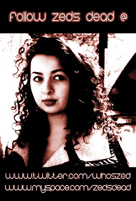
Our digipak is of a professional standard I believe and certainly would stand out if it were to go on mass produce sale in a leading music shop such as HMV. Our digipak front cover does stand out with its use of colour which is black to make the text and Sophia stand out on the cover. Our front cover for the digipak shows the simplicity of the idea which in turn does make it actually better than a complex idea. It has the names of the songs on the back cover sung by the band with 5 songs to listen to. We have also carried on with the idea with the text where the text colour is still white but this time with a red border instead of pink to compliment the black background of the cover. The front cover also promotes the band through social networking sites such as MySpace which is often used by independent artists and bands to get recognition and to promote themselves for free.
Overall I believe that our finished products would stand up to professional products in the market place and compete with leading artists and brands. I think it could stand up and compete due to the fact that it is almost unique and it is Dubstep which is an up and coming music genre that is getting more popular day in day out.
Our video certainly has that wow factor that is needed to be competitive and encourage people to buy the album instead of downloading the album due to the high quality of the advert and the digipak. I would like to say that we would be ideally promoted by a major record label and sold widespread throughout the world but this would be tough to accomplish. However, bands such as the Arctic Monkeys can be used for great inspiration as they initially were unsigned for a period of time and are now part of a major record label.
Q4- How did you use new media technologies in the research, planning, construction and evaluation stages?
Without the use of new media technology this whole entire unit theoretically would be almost impossible to complete to a professional standard. The use of technology has been vital in every stage of this coursework. The use of the internet has been vital. Otherwise we would not have been able to blog our work and products. The use of search engines has always been important especially for research into a particular subject such as my research into star image and power. The internet was very important for this as it allowed me to research into that field and provides an evaluative response to the question on star image and power. The use of social networking websites for me personally was really important. It was important as it allowed me to upload my questionnaires. This allowed me to get some feedback from people on my friends list of Facebook for my audience feedback and our initial questionnaire results for whom to target our audience profile at. Facebook as a social networking website did really me a great deal as it was a time efficient way of getting some quick feedback from my friends. I also used my MySpace account to upload our song Eyes on Fire Remix which also helped a great deal as I got further feedback from my friends who listened to the song which was linked to YouTube.


Julio who did volunteer to be the editor I believe has done a great job. I did contribute and help Julio in the editing suite. I did little editing with the programme Final Cut Pro but I did log shots and help create the time line on the the actual music video. This was vital as it is part of the miscellaneous which needed to be done and can be seen on the blog. However, we all did contribute in the editing suite with advice on which special effects to use and perhaps what colour would look better from a directors point of view. However, the college and the facilities they had were second to none and were brilliant. But, there were times when computers were all occupied and had to wait for other students to finish with them. This was rather annoying and I felt we lost time in the editing suite which is not productive at all.
For the actual construction of the music video, we used the Canon XM2 camcorder. To get thebest qualities from this particular camcorder we needed to know how to set up the extra effects that you would not normally use in every day life. For example, the white balance in particular so that our shots would be clear and not grainy and dark due to the shots we were using in London in the dark. The use of the redhead lights and the lilliputs were non-existent as we were advised we did not need them for our production. I disagreed with this as I had used them in my AS level production and the effect it gives for lighting was really good as you can use a variety of different colours to slide over the light. The use of the playback feature was perhaps the most important feature to this camcorder. This was due to the fact that we had to re shoot on more than one occasion due to poor shots from a previous production shoot in the studio in college. This was a big inconvenience for our actor and group members as we had to reschedule to everybodies preference which wasted even more time.
However, the evaluation process as you can see needed the input of the technology as you cant show videos on a blog on a piece of paper. The use of blogger has come to an important effect to make my evaluation a visual experience for whoever decides to view it. It also makes the use of the images stand out and gives the essay format some meaning and not making it to dull and boring. It is all about the visual experience I feel and connecting with your audience to make it a special experience and give it a lasting effect to the audience and give them a certain wow factor. The only downside with use of blogger is that it is very time consuming. For example, to upload my textual analysis took a very long time as you have to upload every single picture one at a time. This can be very confusing when you have many pictures to upload.
Monday, 18 April 2011
Sunday, 10 April 2011
Rahul's Evaluation
Our media product deviates from a conventional music videos because instead of choosing from either a performance based video or a narrative based video, we decided as a group to incorporate both type of narrative structures. Our narrative featured real life situations for example the heavy drug use, and followed a linier narrative. The emphasis on the following narratives separate our video from the current dubstep videos that have been released such as 'I need air' by magnetic men which is performance based along with 'on a mission' by Katy B.
Click Here To View I Need Air
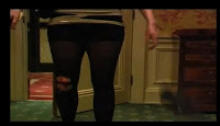
The message we tried to get through to the audience via mis-en-scene was a well off, upper class girl who fell into the drug problems. First off all, you see the actress entering her room in not just plain tops and jeans, but in a dress, a trench coat, and heels to show her being well off, However the use of bloodied ripped tights gives the audience an creates doubt in the viewers mind.
The fact that the room she’s in is not just a normal bedroom, but a very large room that consists of a four post poster bed, a sofa and en suite bathroom all contributes her to looking like a wealthy individual. The other location was in Oxf
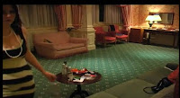 ord Street. Central London is the place where the rich fine and dine, as well as party in some of the best clubs in the world; we tried to show that this particular girl only goes to ‘fine’ places. The main feature that makes our video different from what’s out in the market right now is the use of drugs.
We tend to see videos about happiness and as a group we wanted to go against the conventional videos and the way we tried to demonstrate this overall aura of a sinister feeling was by a variety of camera and lighting techniques. The most powerful technique we used to place the viewers in the actresses shoes was the use of 1st person shots. It makes the audience picture everything how the girl would see it and creates a sense of realism. Canted angles further add to the feeling of disorientation for the viewer, and this helps us to exhibit the woman bei
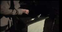 ng on drugs by having the camera shake more often then what you’ll usually see on traditional videos. Low key low level lighting created shadows and played well with the use of drugs because of the shady feel to the final shot. A lot of close ups of objects and props were used in the final video to show viewers what things the girl engaged in her nights out and how it affected her such as alcohol and illegal drugs. Close up on the face added to the facial expression as the viewer can relate to what the actress is going through.
Editing was the most influential part of the video. It created professionalism and the variety of transition we could use to depict certain scenes helped us on the overall continuity of the video. A lot of short takes were placed because it speeds up the final video, and matches the overall pace of the song. Another thing that helped us with the pace was the use of elipses. This helps
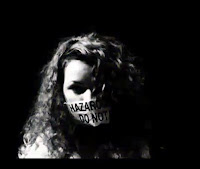 us to give a sense of urgency and positively affected our video as it built up to the most pivotal part of the scenes. The performance part was crucial for thermer. Deep editor to show properly. When performing, heavy emphasis has to be played on the lip syncing as it shows the viewers that’s the perfocolours such as yellow and red were used to show caution and danger as they respectively mean the following. The TV editing style was used not to help the story of the video but to create randomness and set our video apart from what we usually see.
2.) How effective is the combination of your main product and ancillary texts?
The combination of both our main product and ancillary texts have been flown through with a similar pattern. Marketing is no doubt vital to any product. When selling a product to consumers you want to show them what your product is all about without giving a sense of false indication or misleading them to thinking something else. There are only a handful of genres compared to the amount of videos put out. To stand out you either follow convention that everyone would like or deviate from them and attract viewers to it by giving them something new. We decided to go for a genre that just recently has been getting global recognition. Its heavy bassline, use of drums and random melodies makes it stand out from any genre. Not many videos have been shot for a genre like Dubstep, but a recent surge of videos in this type of music is being noticed. However, they all seem to be performance based, for example magnetic men’s video of ‘I Need Air’
The video that inspired us a great deal was smack my bitch up by prodigy. We incorporated its vision of 1st person. It makes the viewer feel as if their main character, and from it we can show moods of the character, e.g. when drunk, the use of canted angles and very shaky camera technique helps us to portray a drunk character.
Click Here To View Smack My Bitch Up
Regarding our digipack we’ve prominently followed typical conventions of digipacks. Firstly we have a front cover of the artist. This is seen in many covers we looked at across all genres. As Sophia was the actress in our video we put her up on it as she sang the lyrics to the son
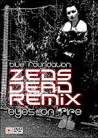 g. A full length body shot allows us to see the body language of the person. This can be related to Katy B’s cover where a mid shot of her is seen on the front cover. With Katy B’s body positioning, we feel as if there’s a mood of motivation behind the album artwork as she’s looking beyond the cover. There are plenty of things we were able to do with our cover, but as the overall aura of the video was unsettling, we had to show a cover that related to the digipack. The use of the crossed hands shows that there’s this sense of secrecy as if the audience do not know what is expected from this digipack. As our track had an overall mood of sinning, the colours of black and red bring out the sinister. The red in particular made the black stand out as it was the outer lining, and made the emphasis more on violence and abuse. The colour black can also be connected with mystery and the overall digipack looks mysterious through the shady colours. With many digipack covers, we see that their main labels are put in the front, for example the parental advisory or dvd/ cd logo.
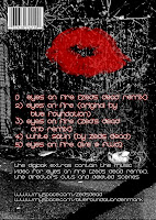
Another thing we notice is that, the track list is always located at the back of the digipack design, and separated from it is the links and companies that have distributed it. As we were an indie label, we do not need many labels and only needed the name of the band as it was the sole contributor to getting the music out there. However we added an extra element to the back cover, mostly the back covers tend to be plain and only consist of a track list. We put a picture of red lips to connote a devilish theme, as red can mean cupid and the devil at the same time. With this, we send a message of naughtiness but nice at the same time.
We can draw comparisons from the movie Sin City. Although a movie, it also holds an ominous vibe to the overall film, and this was shown through its marketing campaign. For example its
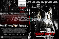 digipack cover. It also consists of high shadowed pictures, the heavy emphasis on black and red to connote evil and danger. The details are located in the back, just like in our digipack, such as links and websites. To continue, on the front we have the mid shot of Jessica Alba. She is pictured with plenty of shadow around the facial area, and the background is similar; very dark and this gives out an eerie feeling, and creates that anticipation of what’s expected to come when watching or listing to the to the product.
What have you learned from your audience feedback?
From our initial target audience we found that from our sample size of 40 (20 males and 20 females). Hip Hop and R & B was the predominant choice of music amongst our audience. As 90% of our results were done by 16-24 year olds we can say that, this is the choice of music the current generation are interested in. To continue, 50% of the audience was of Asian ethnicity, and 30% were white, whilst black and other only accounted to 20%. From this we can conclude that our results are bias towards an Asian community, and looking where we handed out the questionnaires (harrow) we can relate to the Asian ethnicity being high when compared to other places such as Essex.
Another thing we can conclude from initial audience feedback is that, majority of them watch independently made videos. 50% said yes whilst 20% didn’t know. The ones who did select ‘No’ and ‘Don’t know’ only did however watch Hip-Hop or R&B the most. This may affect the final decision on what to go with in the end as the views of the audience were not properly expressed.
An interesting fact we did evaluate from the initial feedback was that the pop genre was not the most favourable genre for the audience. But it’s the genre that sells the most and is the most radio played out of any genre; commercially it is the most successful genre. We gathered that this maybe because of the videos pop singles put out. Nearly every number 1 song has a video and majority of the times it’s a pop song. Whether it’s Lady Gaga or Rihanna they are pop singles. 50% of the audience said that a music video changes their view on a dong positively. This may be how the pop genre influences people into liking their genre.
Our final question asked what people wanted in a music video. Majority of the votes showed that, the audience doesn’t really care where it’s shot. Thus suggesting that the creativity in the video is what entices the viewer. This helped us in making our final decision quicker and easier as creativity was a very important part for the audience.
In order for us to this, we decided that the feedback given to us was positive. We went outside the traditional methods of making a video and challenged it straight away by incorporating danger and heavy drug abuse. By targeting a growing genre, we feel that it’s easier to challenge conventional videos and go for something new as viewers are not costumed to seeing a particular thing in Dubstep. If we choose a Hip Hop or R&B video, you would always expect a performance based video with things such as flashy jewellery, models and love to be associated with their videos. Dubstep however can have many meanings in no lyrics are a part of it. Shots of central London, alley ways and the booking of a country hotel helped us to show a wealthy woman. Alley ways played its part in the mis-en-scene as the audience could feel the impression of something bad. This was what we were targeting as people who do take drugs tend to do it in closure where people cannot see. This definitely gave of that feeling of sinister in our final video.
Audience feedback on final video, digipack and magazine advert
‘WOW, I love this, its so different from what out there’
‘I think u need to use some focus pull, I think it'll make it look real authentic in some parts. the soundtrack is bangin hot too man, nice work bro’
'twas truly epic! Awesome music, stunning visuals
‘I really loved this. The music is ace. The girl who isn't Joedy should have her wind blowing and I would have made her greyscale and not so contrast. Focus pull here and there would be good.’
‘Love the POV shots of Joedy resuming her drug-fest. You could also try some ECU of her pupils dilating to highlight the influence she's been put under.’
‘wow. im so impressed. its proper good. its like those little 3 minute dramas on channel4 or something’
‘The magazine design is top class’
‘For a minute I thought you were showing me a real artists album’
‘How much would it cost if i payed you for this’
I feel as if we exceeded many people’s final expectations including our own. My favour
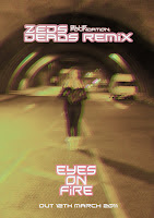 ite part is the magazine and digipack design done by Julio. The genre is parallel to the actual meaning of the song we were trying to show. The use of black and
 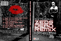 red throughout the main digipack flows excellent with the theme of sinister. The magazine cover certainly looks of a professional standard, and the effect that was put on by our editor truly depicts disorientation. When seeing that at first you feel as a viewer of what’s going on, and the fact it raises questions makes you realise it is interesting and eye catching. It makes it unique fro what’s out there as majority of them are plain and set to a staple colour tone such as white or black. Whilst most digipacks try to show elegance, ours creates a sense of danger and i feel we succeeded in challenging what out there right now.
We did get criticism which was expected as it is a niche genre and not many videos are based around heavy drug use (evil) The audience did want more pull focuses and more close ups of the actress Joedy who was snorting the drugs. This they felt would have made the final video more realistic.
Our USP (unique selling point) is the actual genre. Not much is known about Dubstep, although its growing very rapidly, people are not familiar to it as say Hip Hop. The genre allowed us to create a brand new digi pack which is different from so many album covers there. The video had abstract bits to it, which you don’t see much of as everything contains a performance or meaningful narrative. If backed by heavy promotion for example a major record label, you may be able to see the full effects of how successful the genre is. However as majority of Dubstep videos are independent, the mass appeal through advertising is limited due to the price. Major labels work their way through vertical integration, from making of the raw materials to print producing, advertising and distributing. Indies will have to pay people to advertise and distribute its stuff. But saying that, the viral market is playing a huge factor, and future stars have been scouted via the internet. Firms still haven’t established a proper way to fully take advantage of the net, and as an indie, you would be able to draw in a wide fan base if you can use the internet very well.
4.) How did you use new media technologies in the research, planning, construction and evaluation stages.
The internet played an extremely vital role in this project. The song we decided was firs
 t discovered over the internet, and without the internet, majority of this work would not be possible and kept to the same high standard it is right now. From the very beginning we’ve used blogger to upload all our work. It’s made everything paper free, which supposedly helps us as everything can be kept organised on one dedicated website. Blogger allows us to easily show links and demonstrate certain parts of the videos we w
 ant to show, for example YouTube links and pictures. Another vital internet tool is the social website Facebook. It proved to be very usefull in getting audience feedback. As many people have Facebook, we could easily target a number of audiences and see their opinions instantly. This in return helped us stick to deadlines and sometimes be ahead of it as within minutes we could analyse the data. YouTube, another social site and video site was instrumental in many of our decisions. It gave us ideas for our final media product, and with some many videos up we could compare similar genre videos.
We had a vast array of technology provided to us by the college. Firstly there was the video camera (Cannon XM2) which was a professional video camera. Some of the function
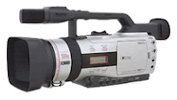 s it had were a white balance feature. This feature tones the colour of the shot by balancing the rich and dull colours between the background and subject to make the final shot more realistic. In the hotel this was very useful as it would set our shots to the best colour possible, and brings out the more vibrant colours in the hotel room, such as the reds and greens. Another thing the camera had been an in built microphone, which made our recording process more fluent because it was at a high standard already which.
We were also given a tripod which was very beneficial. The three legs it stands on redu
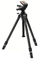 ces the camera shake and blur which makes the final video much smoother and sharper, and also provides better leverage as you’re able to get a better angled shots. For example allowing us to shoot worms’ eye shots or high angle shot without shake or blur. The ball in the tripod allows for maximum rotation and makes it easier to pan from left to right, vice versa due to the way it’s constructed, this makes us get wider screen shots as you can show more of the environment you shoot in.
Ways in which the college equipment enhances our ideas were the editing software they provided. This was by a programme called ‘final cut pro’. Final cut pro is editing software from apple, and its use is to provide editors a chance to manipulate their videos in a way which will seem abstract or as something you’ll see from a music video, and as we were aiming for professionalism in went hand in hand.
We would use our raw footage filmed earlier on, and from the use of an external video rusher, final cut pro allows the user to log and capture our recorded data onto a hard drive. This was a feature that helped us a lot in the early stage of post production because we could upload and name files in a certain order; that allowed our editor to read and search for a file that needed to be placed on the timeline. The timeline was split into four rows, the reason for this is it allows for narrative voice over or external sound to be put over our edited clips to compliment certain shots and keeps the video organised when editing From it, it then could be altered and the clips could be cropped, edited with fades such as, gradual fades, wipe and slide to name a few, as well as adding different colour tones such as black and white to connote the past, or sepia to show a more warmer mood in the video.
All this allowed us to portray certain moods in a scene. For example quick takes of canted angles, first person shots and extreme close ups within a scene created disorientation for the viewer. But we could also create randomness in the video by adding effects such as broken tv. This brought something else to the table for our group and completely went against conventional videos as it is hardly seen in any music videos.
Audience Feedback Questionnaire
( ) Yes ( ) No
Were you able to understand the storyline of the music video?
( ) Yes ( ) No
Did you feel that in the video there were particular camera shots that you liked or felt it was effective?
( ) Yes ( ) No ( ) Don’t know
Did you feel that the visual effects of the video played an important part in portraying a mood of disorientation?
( ) Yes ( ) No ( ) Don’t know
Did you feel the acting in the video was up to professional standards?
( ) Yes ( ) No
Did you feel the props used were believable? (for example, use of fake blood and cocaine)
( ) Yes ( ) No
Did you enjoy the locations used?
( ) Yes ( ) No ( ) Don’t know
Did you feel that the music video was up to professional standards?
( ) Yes ( ) No
Did you feel that the magazine advertisement was up to professional standards?
( ) Yes ( ) No
Did you feel that the magazine advertisement helped to portray a mood of disorientation?
( ) Yes ( ) No
Did you find the use of having links to the artist’s social networking websites in the inner-sleeve will make more likely to visit their website, rather than the use of an individual domain website?
( ) Yes ( ) No ( ) I do not use social networking websites
Did you feel that the design of the digipak was up to professional standards?
( ) Yes ( ) No
Which aspects of the project did you feel helped to portray a brand/identity of professionalism?
( ) The video ( ) The magazine advertisement
( ) Digipak cover ( ) Innersleve
What did not like about the video?
……………………………………………………………………
Would go to buy the digipak after watching the video and seeing the advertisement?
( ) Yes ( ) No ( ) I do not buy music in general
( ) I would download it if it were a legal free download
Wednesday, 6 April 2011
Friday, 4 February 2011
Initial ideas/proposal - Julio
Research Findings
Final Idea
The video will start off with low angle shots, showing a girl in her late teens/early 20s whose name is brooke, coming in from a night out, she enters her bedroom (a posh hotel room) looking rough and haggard, implying that she’s had a serious night out in the city. As she walks into the room, she drops her high-heels on to the floor and walks into the bathroom. She starts to vomit up blood and then proceeds to undress and run a bath. Whilst the bath is running, she comes back into the bedroom and winds up a ballerina jewellery box. As she opens the box to reveal its contents, we see that it’s an array of drugs: cocaine, marijuana, heroin and pills. We also see a large roll of money, which indicates to us that she is very rich, or perhaps work of ‘cash in hand’ like drug smuggling or prostitution. She takes a few pills and snorts a line cocaine. She wipes the remains of cocaine off her nose and lies back on the bed, where she starts to think about the night’s events.
As she slips into a dream like state, we see the beginning of the night’s events unfolding. To indicate that this is a flashback, there will be shot of a clock but played in reverse. She is firstly seen sitting alone on in a cab that is heading into Central London. She steps out of the taxi, pays the fair and walks up through a main road with smoke behind her (referencing the 80’s movie’ Taxi’).
We start to see Brooke walking through the West End and she eventually meets up with two of her friends. They start to look out for a nightclub to go into. While this is happening, we also see shots of people ready to party, nightclubs and traffic connotating the West End’s vibrant nightlife. Every club they go to has a very long queue. The group eventually join one but leave as they are fed up of the queue taking too long and they are very cold. They decide to just buy their own alcohol from an off-licence so they can just get drunk and roam around the West End to have a goodtime. As they are in the middle of drinking, there is a moment where Brooke zones out in her mind and becomes unfocused of what is going on around her. Her friends ask her if she is okay and she pulls out of bag of cocaine from her handbag. Her friends are not willing to take them and get into an argument with Brooke as she is already in a bad state but she is prepared to make herself worse. She becomes very frustrated and tells her friends to “piss off”. We then see the group splitting apart with the camera being on the otherside of the road.
Brooke walks into a dark corner, sprinkles and snorts up a line of cocaine. When she walks back to the main road in her disorientated and drugged up state, she seems to be looking for something, but the audience does not know what it is. She look around a few corners, but only finds people that she doesn’t know doing random/unrelated actions such as; gambling, vomiting and kissing. She also sees a tramp sitting by a corner as well as a hooker looking for customers.
Pre-occupied by all this she accidentally bumps into a man. He helps her up and blows smoke into her face with a grin on his face. As the smoke clears we see that he is an ex-boyfriend who she was previously in an abusive relationship with. He grips her hand and doesn’t let go. She struggles to get of him but finally escapes by pushing him back. As she breaks free she starts running frantically and trips over. Her tights rip and she beings to cry. He goes towards her to help her up and offers her some of his drugs. Her state of loneliness makes her affections draw back to him and they begin to talk to each other.
They eventually walk reach a park bench where they sit down. She takes out a bottle of vodka from her bag and forces the drink down her throat and offers some to him, but he declines. She then takes her shoes off and twirls around on the grass to relish her mind-state. The ex-boyfriend takes out a roll-up of marijuana, lights it up and shares it with Brooke. After this, while taking of her jacket, she starts to realise that her ex-boyfriend could be up to something bad and has a flashback of her boyfriend slapping her. After the flashback, we see him stroking her cheek and she shakes her head, She quickly pushes him onto the floor very violently and runs away – which then the screen fades down.
We revisit the beginning of the music video, seeing her walking down the hotel hallway. As she gets close to her door, she takes a fall but is helped up by another man. Because of the earlier events, she is still scared and screams and pushes him away. When she enters the door, she walks over to the bed to sleep but finds that she is already on the bed, dead from an overdose.
During all of these scenes, we have cutaways to shots of a performance. In this, features the singer and a guitarist under a floodlight, sitting in an all black studio performing towards a camera. This would contain various shots of angles, distance and parts of the face and body.
Location – Central London, Hyde Park and the Grymsdyke hotel.
Time of day – Night.


