1.)In what ways does your media product use, develop or challenge the forms and conventions of real media products?
Our media product deviates from a conventional music videos because instead of choosing from either a performance based video or a narrative based video, we decided as a group to incorporate both type of narrative structures. Our narrative featured real life situations for example the heavy drug use, and followed a linier narrative. The emphasis on the following narratives separate our video from the current dubstep videos that have been released such as 'I need air' by magnetic men which is performance based along with 'on a mission' by Katy B.
Click Here To View I Need Air
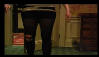
The message we tried to get through to the audience via mis-en-scene was a well off, upper class girl who fell into the drug problems. First off all, you see the actress entering her room in not just plain tops and jeans, but in a dress, a trench coat, and heels to show her being well off, However the use of bloodied ripped tights gives the audience an creates doubt in the viewers mind.
The fact that the room she’s in is not just a normal bedroom, but a very large room that consists of a four post poster bed, a sofa and en suite bathroom all contributes her to looking like a wealthy individual. The other location was in Oxf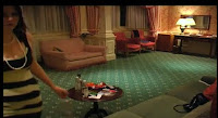 ord Street. Central London is the place where the rich fine and dine, as well as party in some of the best clubs in the world; we tried to show that this particular girl only goes to ‘fine’ places. The main feature that makes our video different from what’s out in the market right now is the use of drugs.
We tend to see videos about happiness and as a group we wanted to go against the conventional videos and the way we tried to demonstrate this overall aura of a sinister feeling was by a variety of camera and lighting techniques. The most powerful technique we used to place the viewers in the actresses shoes was the use of 1st person shots. It makes the audience picture everything how the girl would see it and creates a sense of realism. Canted angles further add to the feeling of disorientation for the viewer, and this helps us to exhibit the woman bei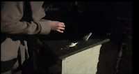 ng on drugs by having the camera shake more often then what you’ll usually see on traditional videos. Low key low level lighting created shadows and played well with the use of drugs because of the shady feel to the final shot. A lot of close ups of objects and props were used in the final video to show viewers what things the girl engaged in her nights out and how it affected her such as alcohol and illegal drugs. Close up on the face added to the facial expression as the viewer can relate to what the actress is going through.
Editing was the most influential part of the video. It created professionalism and the variety of transition we could use to depict certain scenes helped us on the overall continuity of the video. A lot of short takes were placed because it speeds up the final video, and matches the overall pace of the song. Another thing that helped us with the pace was the use of elipses. This helps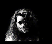 us to give a sense of urgency and positively affected our video as it built up to the most pivotal part of the scenes. The performance part was crucial for thermer. Deep editor to show properly. When performing, heavy emphasis has to be played on the lip syncing as it shows the viewers that’s the perfocolours such as yellow and red were used to show caution and danger as they respectively mean the following. The TV editing style was used not to help the story of the video but to create randomness and set our video apart from what we usually see.
2.) How effective is the combination of your main product and ancillary texts?
The combination of both our main product and ancillary texts have been flown through with a similar pattern. Marketing is no doubt vital to any product. When selling a product to consumers you want to show them what your product is all about without giving a sense of false indication or misleading them to thinking something else. There are only a handful of genres compared to the amount of videos put out. To stand out you either follow convention that everyone would like or deviate from them and attract viewers to it by giving them something new. We decided to go for a genre that just recently has been getting global recognition. Its heavy bassline, use of drums and random melodies makes it stand out from any genre. Not many videos have been shot for a genre like Dubstep, but a recent surge of videos in this type of music is being noticed. However, they all seem to be performance based, for example magnetic men’s video of ‘I Need Air’
The video that inspired us a great deal was smack my bitch up by prodigy. We incorporated its vision of 1st person. It makes the viewer feel as if their main character, and from it we can show moods of the character, e.g. when drunk, the use of canted angles and very shaky camera technique helps us to portray a drunk character.
Click Here To View Smack My Bitch Up
Regarding our digipack we’ve prominently followed typical conventions of digipacks. Firstly we have a front cover of the artist. This is seen in many covers we looked at across all genres. As Sophia was the actress in our video we put her up on it as she sang the lyrics to the son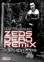 g. A full length body shot allows us to see the body language of the person. This can be related to Katy B’s cover where a mid shot of her is seen on the front cover. With Katy B’s body positioning, we feel as if there’s a mood of motivation behind the album artwork as she’s looking beyond the cover. There are plenty of things we were able to do with our cover, but as the overall aura of the video was unsettling, we had to show a cover that related to the digipack. The use of the crossed hands shows that there’s this sense of secrecy as if the audience do not know what is expected from this digipack. As our track had an overall mood of sinning, the colours of black and red bring out the sinister. The red in particular made the black stand out as it was the outer lining, and made the emphasis more on violence and abuse. The colour black can also be connected with mystery and the overall digipack looks mysterious through the shady colours. With many digipack covers, we see that their main labels are put in the front, for example the parental advisory or dvd/ cd logo.
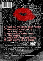
Another thing we notice is that, the track list is always located at the back of the digipack design, and separated from it is the links and companies that have distributed it. As we were an indie label, we do not need many labels and only needed the name of the band as it was the sole contributor to getting the music out there. However we added an extra element to the back cover, mostly the back covers tend to be plain and only consist of a track list. We put a picture of red lips to connote a devilish theme, as red can mean cupid and the devil at the same time. With this, we send a message of naughtiness but nice at the same time.
We can draw comparisons from the movie Sin City. Although a movie, it also holds an ominous vibe to the overall film, and this was shown through its marketing campaign. For example its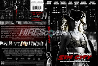 digipack cover. It also consists of high shadowed pictures, the heavy emphasis on black and red to connote evil and danger. The details are located in the back, just like in our digipack, such as links and websites. To continue, on the front we have the mid shot of Jessica Alba. She is pictured with plenty of shadow around the facial area, and the background is similar; very dark and this gives out an eerie feeling, and creates that anticipation of what’s expected to come when watching or listing to the to the product.
Our media product deviates from a conventional music videos because instead of choosing from either a performance based video or a narrative based video, we decided as a group to incorporate both type of narrative structures. Our narrative featured real life situations for example the heavy drug use, and followed a linier narrative. The emphasis on the following narratives separate our video from the current dubstep videos that have been released such as 'I need air' by magnetic men which is performance based along with 'on a mission' by Katy B.
Click Here To View I Need Air

The message we tried to get through to the audience via mis-en-scene was a well off, upper class girl who fell into the drug problems. First off all, you see the actress entering her room in not just plain tops and jeans, but in a dress, a trench coat, and heels to show her being well off, However the use of bloodied ripped tights gives the audience an creates doubt in the viewers mind.
The fact that the room she’s in is not just a normal bedroom, but a very large room that consists of a four post poster bed, a sofa and en suite bathroom all contributes her to looking like a wealthy individual. The other location was in Oxf
 ord Street. Central London is the place where the rich fine and dine, as well as party in some of the best clubs in the world; we tried to show that this particular girl only goes to ‘fine’ places. The main feature that makes our video different from what’s out in the market right now is the use of drugs.
We tend to see videos about happiness and as a group we wanted to go against the conventional videos and the way we tried to demonstrate this overall aura of a sinister feeling was by a variety of camera and lighting techniques. The most powerful technique we used to place the viewers in the actresses shoes was the use of 1st person shots. It makes the audience picture everything how the girl would see it and creates a sense of realism. Canted angles further add to the feeling of disorientation for the viewer, and this helps us to exhibit the woman bei
 ng on drugs by having the camera shake more often then what you’ll usually see on traditional videos. Low key low level lighting created shadows and played well with the use of drugs because of the shady feel to the final shot. A lot of close ups of objects and props were used in the final video to show viewers what things the girl engaged in her nights out and how it affected her such as alcohol and illegal drugs. Close up on the face added to the facial expression as the viewer can relate to what the actress is going through.
Editing was the most influential part of the video. It created professionalism and the variety of transition we could use to depict certain scenes helped us on the overall continuity of the video. A lot of short takes were placed because it speeds up the final video, and matches the overall pace of the song. Another thing that helped us with the pace was the use of elipses. This helps
 us to give a sense of urgency and positively affected our video as it built up to the most pivotal part of the scenes. The performance part was crucial for thermer. Deep editor to show properly. When performing, heavy emphasis has to be played on the lip syncing as it shows the viewers that’s the perfocolours such as yellow and red were used to show caution and danger as they respectively mean the following. The TV editing style was used not to help the story of the video but to create randomness and set our video apart from what we usually see.
2.) How effective is the combination of your main product and ancillary texts?
The combination of both our main product and ancillary texts have been flown through with a similar pattern. Marketing is no doubt vital to any product. When selling a product to consumers you want to show them what your product is all about without giving a sense of false indication or misleading them to thinking something else. There are only a handful of genres compared to the amount of videos put out. To stand out you either follow convention that everyone would like or deviate from them and attract viewers to it by giving them something new. We decided to go for a genre that just recently has been getting global recognition. Its heavy bassline, use of drums and random melodies makes it stand out from any genre. Not many videos have been shot for a genre like Dubstep, but a recent surge of videos in this type of music is being noticed. However, they all seem to be performance based, for example magnetic men’s video of ‘I Need Air’
The video that inspired us a great deal was smack my bitch up by prodigy. We incorporated its vision of 1st person. It makes the viewer feel as if their main character, and from it we can show moods of the character, e.g. when drunk, the use of canted angles and very shaky camera technique helps us to portray a drunk character.
Click Here To View Smack My Bitch Up
Regarding our digipack we’ve prominently followed typical conventions of digipacks. Firstly we have a front cover of the artist. This is seen in many covers we looked at across all genres. As Sophia was the actress in our video we put her up on it as she sang the lyrics to the son
 g. A full length body shot allows us to see the body language of the person. This can be related to Katy B’s cover where a mid shot of her is seen on the front cover. With Katy B’s body positioning, we feel as if there’s a mood of motivation behind the album artwork as she’s looking beyond the cover. There are plenty of things we were able to do with our cover, but as the overall aura of the video was unsettling, we had to show a cover that related to the digipack. The use of the crossed hands shows that there’s this sense of secrecy as if the audience do not know what is expected from this digipack. As our track had an overall mood of sinning, the colours of black and red bring out the sinister. The red in particular made the black stand out as it was the outer lining, and made the emphasis more on violence and abuse. The colour black can also be connected with mystery and the overall digipack looks mysterious through the shady colours. With many digipack covers, we see that their main labels are put in the front, for example the parental advisory or dvd/ cd logo.
Another thing we notice is that, the track list is always located at the back of the digipack design, and separated from it is the links and companies that have distributed it. As we were an indie label, we do not need many labels and only needed the name of the band as it was the sole contributor to getting the music out there. However we added an extra element to the back cover, mostly the back covers tend to be plain and only consist of a track list. We put a picture of red lips to connote a devilish theme, as red can mean cupid and the devil at the same time. With this, we send a message of naughtiness but nice at the same time.
We can draw comparisons from the movie Sin City. Although a movie, it also holds an ominous vibe to the overall film, and this was shown through its marketing campaign. For example its
 digipack cover. It also consists of high shadowed pictures, the heavy emphasis on black and red to connote evil and danger. The details are located in the back, just like in our digipack, such as links and websites. To continue, on the front we have the mid shot of Jessica Alba. She is pictured with plenty of shadow around the facial area, and the background is similar; very dark and this gives out an eerie feeling, and creates that anticipation of what’s expected to come when watching or listing to the to the product.
What have you learned from your audience feedback?
From our initial target audience we found that from our sample size of 40 (20 males and 20 females). Hip Hop and R & B was the predominant choice of music amongst our audience. As 90% of our results were done by 16-24 year olds we can say that, this is the choice of music the current generation are interested in. To continue, 50% of the audience was of Asian ethnicity, and 30% were white, whilst black and other only accounted to 20%. From this we can conclude that our results are bias towards an Asian community, and looking where we handed out the questionnaires (harrow) we can relate to the Asian ethnicity being high when compared to other places such as Essex.
Another thing we can conclude from initial audience feedback is that, majority of them watch independently made videos. 50% said yes whilst 20% didn’t know. The ones who did select ‘No’ and ‘Don’t know’ only did however watch Hip-Hop or R&B the most. This may affect the final decision on what to go with in the end as the views of the audience were not properly expressed.
An interesting fact we did evaluate from the initial feedback was that the pop genre was not the most favourable genre for the audience. But it’s the genre that sells the most and is the most radio played out of any genre; commercially it is the most successful genre. We gathered that this maybe because of the videos pop singles put out. Nearly every number 1 song has a video and majority of the times it’s a pop song. Whether it’s Lady Gaga or Rihanna they are pop singles. 50% of the audience said that a music video changes their view on a dong positively. This may be how the pop genre influences people into liking their genre.
Our final question asked what people wanted in a music video. Majority of the votes showed that, the audience doesn’t really care where it’s shot. Thus suggesting that the creativity in the video is what entices the viewer. This helped us in making our final decision quicker and easier as creativity was a very important part for the audience.
In order for us to this, we decided that the feedback given to us was positive. We went outside the traditional methods of making a video and challenged it straight away by incorporating danger and heavy drug abuse. By targeting a growing genre, we feel that it’s easier to challenge conventional videos and go for something new as viewers are not costumed to seeing a particular thing in Dubstep. If we choose a Hip Hop or R&B video, you would always expect a performance based video with things such as flashy jewellery, models and love to be associated with their videos. Dubstep however can have many meanings in no lyrics are a part of it. Shots of central London, alley ways and the booking of a country hotel helped us to show a wealthy woman. Alley ways played its part in the mis-en-scene as the audience could feel the impression of something bad. This was what we were targeting as people who do take drugs tend to do it in closure where people cannot see. This definitely gave of that feeling of sinister in our final video.
Audience feedback on final video, digipack and magazine advert
‘WOW, I love this, its so different from what out there’
‘I think u need to use some focus pull, I think it'll make it look real authentic in some parts. the soundtrack is bangin hot too man, nice work bro’
'twas truly epic! Awesome music, stunning visuals
‘I really loved this. The music is ace. The girl who isn't Joedy should have her wind blowing and I would have made her greyscale and not so contrast. Focus pull here and there would be good.’
‘Love the POV shots of Joedy resuming her drug-fest. You could also try some ECU of her pupils dilating to highlight the influence she's been put under.’
‘wow. im so impressed. its proper good. its like those little 3 minute dramas on channel4 or something’
‘The magazine design is top class’
‘For a minute I thought you were showing me a real artists album’
‘How much would it cost if i payed you for this’
I feel as if we exceeded many people’s final expectations including our own. My favour
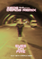 ite part is the magazine and digipack design done by Julio. The genre is parallel to the actual meaning of the song we were trying to show. The use of black and
 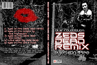 red throughout the main digipack flows excellent with the theme of sinister. The magazine cover certainly looks of a professional standard, and the effect that was put on by our editor truly depicts disorientation. When seeing that at first you feel as a viewer of what’s going on, and the fact it raises questions makes you realise it is interesting and eye catching. It makes it unique fro what’s out there as majority of them are plain and set to a staple colour tone such as white or black. Whilst most digipacks try to show elegance, ours creates a sense of danger and i feel we succeeded in challenging what out there right now.
We did get criticism which was expected as it is a niche genre and not many videos are based around heavy drug use (evil) The audience did want more pull focuses and more close ups of the actress Joedy who was snorting the drugs. This they felt would have made the final video more realistic.
Our USP (unique selling point) is the actual genre. Not much is known about Dubstep, although its growing very rapidly, people are not familiar to it as say Hip Hop. The genre allowed us to create a brand new digi pack which is different from so many album covers there. The video had abstract bits to it, which you don’t see much of as everything contains a performance or meaningful narrative. If backed by heavy promotion for example a major record label, you may be able to see the full effects of how successful the genre is. However as majority of Dubstep videos are independent, the mass appeal through advertising is limited due to the price. Major labels work their way through vertical integration, from making of the raw materials to print producing, advertising and distributing. Indies will have to pay people to advertise and distribute its stuff. But saying that, the viral market is playing a huge factor, and future stars have been scouted via the internet. Firms still haven’t established a proper way to fully take advantage of the net, and as an indie, you would be able to draw in a wide fan base if you can use the internet very well.
4.) How did you use new media technologies in the research, planning, construction and evaluation stages.
The internet played an extremely vital role in this project. The song we decided was firs
 t discovered over the internet, and without the internet, majority of this work would not be possible and kept to the same high standard it is right now. From the very beginning we’ve used blogger to upload all our work. It’s made everything paper free, which supposedly helps us as everything can be kept organised on one dedicated website. Blogger allows us to easily show links and demonstrate certain parts of the videos we w
 ant to show, for example YouTube links and pictures. Another vital internet tool is the social website Facebook. It proved to be very usefull in getting audience feedback. As many people have Facebook, we could easily target a number of audiences and see their opinions instantly. This in return helped us stick to deadlines and sometimes be ahead of it as within minutes we could analyse the data. YouTube, another social site and video site was instrumental in many of our decisions. It gave us ideas for our final media product, and with some many videos up we could compare similar genre videos.
We had a vast array of technology provided to us by the college. Firstly there was the video camera (Cannon XM2) which was a professional video camera. Some of the function
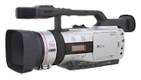 s it had were a white balance feature. This feature tones the colour of the shot by balancing the rich and dull colours between the background and subject to make the final shot more realistic. In the hotel this was very useful as it would set our shots to the best colour possible, and brings out the more vibrant colours in the hotel room, such as the reds and greens. Another thing the camera had been an in built microphone, which made our recording process more fluent because it was at a high standard already which.
We were also given a tripod which was very beneficial. The three legs it stands on redu
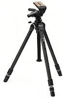 ces the camera shake and blur which makes the final video much smoother and sharper, and also provides better leverage as you’re able to get a better angled shots. For example allowing us to shoot worms’ eye shots or high angle shot without shake or blur. The ball in the tripod allows for maximum rotation and makes it easier to pan from left to right, vice versa due to the way it’s constructed, this makes us get wider screen shots as you can show more of the environment you shoot in.
Ways in which the college equipment enhances our ideas were the editing software they provided. This was by a programme called ‘final cut pro’. Final cut pro is editing software from apple, and its use is to provide editors a chance to manipulate their videos in a way which will seem abstract or as something you’ll see from a music video, and as we were aiming for professionalism in went hand in hand.
We would use our raw footage filmed earlier on, and from the use of an external video rusher, final cut pro allows the user to log and capture our recorded data onto a hard drive. This was a feature that helped us a lot in the early stage of post production because we could upload and name files in a certain order; that allowed our editor to read and search for a file that needed to be placed on the timeline. The timeline was split into four rows, the reason for this is it allows for narrative voice over or external sound to be put over our edited clips to compliment certain shots and keeps the video organised when editing From it, it then could be altered and the clips could be cropped, edited with fades such as, gradual fades, wipe and slide to name a few, as well as adding different colour tones such as black and white to connote the past, or sepia to show a more warmer mood in the video.
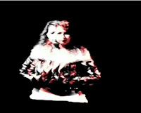
All this allowed us to portray certain moods in a scene. For example quick takes of canted angles, first person shots and extreme close ups within a scene created disorientation for the viewer. But we could also create randomness in the video by adding effects such as broken tv. This brought something else to the table for our group and completely went against conventional videos as it is hardly seen in any music videos.
No comments:
Post a Comment